Showing posts with label series. Show all posts

Sunday, 14 January 2018

"To Britain's Shores" - Chapter 17 - Spring

At last. A morning where it isn't just miserably wet and grey. I was starting to hate these British winters.

This past one, particularly. Strange, as old Theobald used to say about Leofric the Drunkard, how you don't miss something till it's not there any more. No Ecgwine, blue eyes aflame, brashly questioning the Young Wolf's decisions. No Lavinia, with her head of raven-dark hair leaning next to his unruly straw-pale mop, slim hand on his arm and the quiet word that tempers his rashness. Truth, we'd seen less of that this last year, as he'd started to learn wisdom from all of us, and she'd thus had to do it more infrequently.

But Ecgwine's dead, a British spear in his side, and she... who knows? Left in the night on Aelfric's second-best horse. The Cyning's Hall in Caer Lind Colon - Odin's blood, that's still a barbarous mouthful of a name - seems that bit darker without them both, and we...

We have become grim.

Resolute.

Cold.

Iron.

The ring of metal on metal has been the music of the Hall most days, with none questioning our Cyning's resolve to make us harder, better. Which is why I'm here in one of the Hall's outbuildings, sorting through a batch of new-made spear points. That and it gives me something to do.

We're missing Beornwulf too this winter, sent on a thankless task to bear news of his son's passing to Ecgfrith across the great sea - Ecgfrith the Cyning, Aelfric's father's brother, who charged us - me and Aelfric especially - to take care of his son and make him a man. "You can't argue we managed one of those...."

"Mmm?" Aelfric, damn him, still has a habit of sneaking up on me.

"I... uh. Just musing aloud." He eyes me for a moment, with that maddeningly prompting look of his. I sigh. "Ecgwine." Again the regard. "Your uncle. 'Keep him safe. Make him a man.'"

Aelfric nods, "We tried." A pause, then, ruefully. "And we were..."

"Ho there!!!!!" It's a yell from the gate, young Hedric. "Someone's coming up the round. A band of men..."

The Young Wolf treats me to a sudden grin. "I'll bet you it's Beornwulf."

I grin back. "Not taking that bet. I'll catch you up when I've tidied this lot away."

I head for the gate, slipping through between a couple of the buildings to join the throng: there's much backslapping of Beornwulf, and the group of warriors he's brought across the sea with him. Hel's teeth, he's even managed to persuade the tall, rangy Deorwine, one of Ecgfrith's Gedriht that I actually don't have any grievance with, to join him. He's a skilled horseman, and a fine warrior, quiet yet intelligent: never a score of words when two will do. I'm just about to clasp him by the hand when a slap on my back nearly knocks the breath out of me.

"Not dead yet, then, Godric?"

I really should have spotted that distinctive hair amid the small crowd, but she isn't tall, certainly not among men. The voice, though, is unmistakably hers, a low alto rasp. I allow myself a second or two, as Deorwine gives me a knowing wink, lips quirking in an amused grin, before I turn. "Gytha."

There might be even more grey in her locks, but other than that she hasn't changed in the time since we left. Hair the colour of iron down to her shoulders; the same well-worn mail; axe and sword at her belt; the white line of a scar the length of her cheek from a blade; eyes the grey of a winter sky.

A smile, rendered slightly crooked by that scar, quirks her lips. "Miss me?"

She always did start with the difficult questions.

Now if I could actually find the box that has Bad Squiddo's shieldmaiden warriors blister in it (which I'd link to, but I can't find it on Annie's site either!), I'd have Gytha painted up by now. Unfortunately, I suspect it's somewhere in the stuff we cleared out of the workshop so the builders could do their stuff, which means I have almost no space to move stuff into to search for it. That and it's cold out.

Wednesday, 10 January 2018

Setting up a blog: Part 2 - headers, footers and sidebars

Ok, so, you have a post. But it's looking kind of lonely by itself, and everyone else's blog has cool sidebars and stuff...

Right. Go to your blog's management page (click on the B in a square, top left if you're not there already), and click Layout.
You should see a bunch of boxes that contain things labelled 'gadgets' in something that looks like the rough layout of things on your main blog page. (Tip for this: pick a theme like 'Simple' or 'Awesome Inc' for starters, as it makes working with this much more obvious. Don't pick "Notable"!)

Lets go through some of these. All you need to do to make changes is click the little Edit link in the bottom right corner of the gadget's box.

  • The Favicon gadget just sets the icon that appears in your browser toolbar when you visit the site. All you need is a small logo, 100px square, and you just upload it.
  • The Header->Navbar gadget controls the Blogger navber across the top of your page - you can turn it off, or change its colours to match your blog.
  • The Header->Page Header gadget allows you to set a banner image, fix the title and change the description of your blog. 
Ignore the boxes with 'Add a gadget' in for now - we'll cover useful other gadgets next time.
  • In the Main section, you have the Blog Posts gadget - this allows you to configure things like the date format, how many posts or how many days of posts to display, what data you want to display about the post, etc. Again, it's all pretty self-explanatory and like everything else here, the beauty of it is it's really hard to break things!
  • Featured Post allows you to tag a post as being exactly that, if the theme supports it. You can make it the most recent or if, say, you have a welcome/about post you want to be always visible, you can make it that instead.
  • Popular Posts gadget - does what it says on the tin - one thing to be aware of is that you can define the time range over which 'popular' is measured, depending on whether you want a bias towards recent material. I have a very odd post that has an insane amount of hits (well over 20,000 and twice as much as the next nearest...) for no reason I can see, and I've tweaked that setting so it gets ignored as being too old.
Now we come to the sidebar:
  • The About Me gadget takes your 'about me' entry from your Google profile as your author bio. You may want to consider if you actually want to do this, especially if you use your Google account for multiple things and thus have a non-subject-specific bio! If you don't, but still want a bio in the sidebar, I'll show you how in the next post.
  • Blog Archive shows a list of posts by month, or week, or day - very handy for letting your users navigate through your posting history once you have one.
  • Labels: as you probably noticed last time, you can label a post with keywords, This just allows viewers to click on a keyword and find the posts that use it. Both this and the Blog Archive you might want to remove until you have enough posts for it not to be embarrassing. 
  • Report Abuse: link so viewers can do exactly that. Not configurable beyond having it there or not.
  • Pages gadget - you can create static pages in your blog - such as the Linnius Campaign one here. They're a useful way of keeping more permanent content handy, and this gadget lets you display a list.
  • Search this Blog, and Follow By Email. Do what they say on the tin.
Last, the footer.
  • Attribution gadget. If you do nothing else, go read this article and then edit this gadget so your blog has a copyright/attribution notice, and consider creating a copyright page. And remember to change the year every Jan 1 (like I forgot last year)!
And there you go. Pretty sure some of this was obvious, but I hope there was some useful insight here. Next time, adding new gadgets.

Sunday, 7 January 2018

Starting a blog: Part 1 - getting set up

I had a question from a reader (and actually, not for the first time) the other day, on the general "how" of getting a blog like this set up. It's not hard, but it can seem a bit daunting at first, so, in the interests of having the answer somewhere that can be saved for posterity, I thought I'd do it as a blog post - in fact, inevitably, this is going to be a series!

First up, why Blogger? The simple answer is, because most of the blogging wargamers are using it, and it gives you the chance to join the community.

With that said... go to https://www.blogger.com/ and click on the 'Create Your Blog' button. It will prompt you to log in with a Google account - I'm assuming you have one, since most folks do: if not, you'll need to create one before you can use Blogger.

You'll then be prompted for a title for your blog and a domain name. The former can be whatever you choose, the latter will be <something>.blogspot.com.  As far as the <something> goes, it can be whatever you like as long as it's a) memorable, b) unique and c) only contains letters, numbers and dashes.

At this point you also get to pick a theme. This you can change later, so pick one that looks OK, and then click on 'Create Blog!'. Ignore the Google Domains prompt (they're after your money!) that follows.

There. You have a blog. That wasn't so hard!

You'll now be faced with the management screen - see right. The first thing you'll probably want to do is create a post, which is all in all pretty easy: hit New Post, give it a subject, start typing - c'mon, this is the easy bit, you wanted to create a blog so you must have something to say!

When you're done, hit Publish, and there you go. Your blog has content!

Next up, I'll cover adding fixed content such as sidebars etc, to your blog.

Sunday, 26 June 2016

Colour Concepts 5: what colour is ... rock?

Seriously. Not this colour, or shaded
variants of it. Really. Even if it's the one
GW put in their terrain pack along with
that brown that isn't soil-coloured...
OK. Time for a rant.

Rock is not grey.

Specifically rock and stone, with a very very small set of exceptions. are not THIS grey that people always paint them.

This is our old friend RGB #708090 which a decent number of people consider 'pure grey'. The only rocks that come close to that colour are mostly slate and some granite, but in general? Most rocks are no more that shade of grey than most soil is a kid's crayon brown.

Raglan
Don't believe me? Go Google for images of castles (you'll need to hit the image tab and mind out for Nathan Fillion!). See anything that colour? Thought not. Even Raglan Castle, which can look grey from a distance in some photos, surprisingly isn't from close up.

We also come back here to how light affects things - if you do a search for Raglan Castle, say, and look at the range of images on offer, see how much the colour varies depending on time of day, sun vs cloudy sky, etc. The guidebook actually describes it as 'yellow sandstone'!

So what colour is stone?

Guess what?

Those lovely folks from Munsell, not content with keeping archaeologists and soil scientists happy, do a series of rock colour charts too :D That aside, if you think a 200 buck colour chart is a bit much for your hobby, I suggest a bit of Googling, and trying to match. Be aware, though (and this is something we need to discuss in a later article), large expenses of colour in smaller scales look wrong unless you lighten them and de-saturate them a bit from their original shade.

I'm currently using my three stage drybrush over Sandtex Bitter Chocolate that I use for soil, and then knocking back the very pale final shade of cream/'magnolia' with a wash of Army Painter Soft Tone ink, which also has the advantage of restoring some of the surface detail if I've been a bit heavy-handed. But it's up to you - that's one specific rock colour/shade out of a wide spectrum from reddish to almost grey, and many points in between and outliers.

Granite, showing its crystalline mix.
Granite is an interesting crystalline mix, and if you WANT a granite keep (say), the reason it looks grey is that it's a mixture of white quartz crystals and other darker ones, not because it's actually a uniform colour! And some granite can be pink.

Ok. So. Anyone any suggestions for a water-based equivalent to Army Painter Soft Tone that I can buy in larger quantities than 15ml droppers? I may have a LOT of stone to paint.

Monday, 20 June 2016

Colour Concepts 4: what colour is... soil?

Every kid knows, soil is brown. Give a five year old a set of crayons, and the one he picks for mud, soil, earth will be brown.

Right. Sure.

Go do a Google image search for 'soil texture'. Now sure, some of those you would fairly call brown, but I'd lay odds that most of them aren't the shade of brown a kid would pick.

I don't know about you, but the soil in my garden at present looks like the image on the right here. It's not rained in the last couple of days, and if I pass Apple's colour picker over it, the colour turns out to range somewhere along this gradient:


The RGB values for both ends of that gradient are actually, as near as makes no nevermind, grey, very very slightly tinged towards red. I'm not suggesting all soils are that colour, of course - far from it. If it's been raining, our soil's much darker, for a start. And yes, soil can be brown, especially if it's got more clay in it: in fact it can even end up distinctly reddish.

In fact... there's a very nice tool the real soil experts use for soil colour. You probably have to be a complete soil nerd to care to the extent the Munsell Soil Colour scale cares, especially since the official chart book is about 200 bucks, but there are a few online versions that show you some of the (many) ranges of colour that soil can be. While I can get detail obsessed about things like horses and heraldry, I'm not entirely sure I can get sufficiently worked up about soil to buy a copy.

Where does that leave us?

Fundamentally, not a lot better off :D There's a huge range of soil colours, and about the only thing we can say is that that hideous milk-chocolate brown GW supplied in their terrain set is nowhere near as common as your inner 5 year old (or someone at GW) thinks. As you've probably noticed, I've been using a series of dry brushes over a base coat to represent soil: the base colour is Sandtex Bitter Chocolate, which is a dark brown that dries a lot greyer than it looks when wet, and then successive layers of progressively lighter creamish/greyish browns to a final drybrush with good old 'magnolia' (basically pale cream).

To a degree, though, it really is 'your mileage may vary'. If I was doing NW Europe rather than sun-dried Iberian Peninsula, I'd use the same base coat but my final drybrush would be a bit less cream, more a light neutral (i.e. not bluish) grey. That said, if you look at the stuff I've done from a distance? it looks grey :D

Wednesday, 1 June 2016

Colour Concepts 3: 50 shades of grey....

Oh, c'mon. You knew that title had to get worked in somewhere, right?

So. A little side post preparatory to discussing the colour of some things in nature. Think about the answer to this question before you click "Read more" (and don't cheat and use a colour picker!):


Actually, I'll ask it in a number of different ways, so:
Which of these squares is best described as grey?
If you were asked to paint something plain grey, which one would you pick?
Which of these is the closest to pure grey?

Tuesday, 24 May 2016

Colour Concepts: 2 - What colour is.... white?

Ok - this might seem like a really strange way to kick off the series proper, but trust me, there's a reason for it. And this article is also technically "Photographing Miniatures 6: White Balance", for reasons which will become rapidly apparent.

To start with, then - how do we see colour? Why is a leaf green?

When light falls on something, three things happen to varying degrees depending on the colour/wavelength of light, namely it can be absorbed, scattered, or reflected. Reflected we'll leave for later (see... ohhh, I dunno? Water? Glass?) but what's scattered and what's absorbed determine its colour.

White light - pure white light - is made up of a spectrum of colours, as per the classic prism demonstration. If you look at your TV, your computer screen, or a LED colour-changing light, closely, you'll see that in fact you can make white (in fact most colours) from a combination of various proportions of red, green and blue (have a play with the link).

So, why are leaves green? Because they've evolved to absorb the red and blue ends of the spectrum for photosynthesis, and scatter the rest, i.e. green wavelengths - result? A green leaf [1]. If something absorbs all wavelengths, it'll be black - and often that means it absorbs the infra-red off the red end of the spectrum as well, and is why black objects get hotter in the sun.

However... the important thing to note is that an object can only scatter what's falling on it. Allow me to demonstrate, with the aid of a camera, my shiny new LED colour-changing living room lights (which use combinations of red, green and blue to make a wide spectrum of possible colours), and a colour balance test card.

The card under 'pure' white.

For the colour-blind (like my wife) the strips are:
top to bottom left:
blue, red, magenta, green, cyan, yellow, grey.
middle small strips:
white, black, cyan, black, magenta, grey, blue
right side:
black, 3 narrow shades of dark grey, black, purple, white, dark blue
Red light

Green light (not very good green, more a sickly greenish-
white, but it's the best the fittings will do)
Blue light

Purple light
Neat, huh? Notice how the white stops being white, because there isn't a full rainbow of colour for it to reflect, and how all the other colours change. Also notice how, for example, you can't pick out the red from the white under red light [2].

Which leads us to the question in the title. Let's have a look again at the test card under fluorescent light, and under warm and cold white from the living room lights.

Very 'Warm' white light (as far down the 'warm' end as my
lights will let me).

About the equivalent of old-school incandescent lights

About the same as natural sunlight.

Natural shade (a very 'cold' blue white).

Under the fluorescents in the kitchen :D
The interesting thing is that what you see in the photos is NOT how your brain processes what your eyes give you - if you looked at any of those in isolation, your brain would correct for the white, as cameras can be set up to do automatically or manually. In this case, obviously, I've deliberately set the camera not to compensate for the different lighting: it's locked to 'daylight in the shade' as that's what I had it set to for the light at Partizan, and you will notice that (for example) the card under the fluorescent strips in our kitchen has a noticeable orange cast, because there's not enough blue wavelengths in the output from the tube).

Of course, how YOU see the above images will also depend on what your monitor thinks 'white' is :D

[1] So why do blue and yellow paint (as opposed to light) make green? 
[2] My wife once wrote a set of crib notes for a set list with our band in red ink. You can imagine her consternation when the stage lights turned out to be predominantly red.

Friday, 20 May 2016

Colour Concepts: 1 - Introduction

I seem to have been thinking a lot about colour, lately - what colour things are, and, almost as importantly, what colour things aren't. We have as human beings a lot of pre-conceived ideas as to what colour things are - ask a child, and they'll tell you water is blue, earth is brown, sand is yellow, etc - and a lot of these are actually quite startlingly wrong if you actually look at the thing in question. And a lot of those misconceptions we carry into adulthood.

So, with that in mind, it's past time we had another series on this blog, and so here's 'Colour Concepts', a series of ponderings on what colour things actually are.

As a free starter, which if you aren't a regular reader of this blog you can go catch up on, and if you are you should know already:

There's no such thing as a brown horse (well, actually, there is, but it's rarer than you think!). And white horses often aren't white

Thursday, 31 March 2016

Battle Report - 28 March 2016 - Dux Britanniarum

So here we are with the first playtest of a new raid scenario for The Dux Britanniarum Compendium.

Standard practice for these is I write up the scenario page, and hand it to Andy to set up without help from me, as that's usually a great way of finding out where I've not written things down because I thought they were obvious.

As per normal, terrain setup is random, and we're aiming every time we do this, at least to start with, to either have a random choice of two scenarios to test (so as not to colour our terrain choice) or get a third party to set up terrain.

Warbases' rather fine stag model making a bid for freedom.
This scenario is currently named 'Deer Hunt' but may get renamed to something a bit more evocative - given the way the rulebook scenarios are named, probably 'Hunt For The White Stag'. Essentially, both sides have heard rumour of a mighty stag that they wish to bring down, and there's a fairly disordered (deliberately) set of setup conditions as the various groups and nobles straggle onto the battlefield looking for the stag.

The stag is set up basically to run from one short edge of the table to the other, with some rules to make it veer away from units.

"After that stag, lads!"
Things worked out pretty well - we had a fascinating standoff between the two lords, neither wanting to pursue the stag as it would mean turning a flank to the other, and of course, both of us probably had Carpe Diem cards, which would have made that rather painful. I blew am Aggressive Charge to get a hit bonus on the stag with a group of warriors, failed to kill it and got a warrior nastily gored for my pains, before the stag broke from combat and kept running.

"After you."
"No, after you."
Several bowshots from both sides followed it, but it managed, eventually, to flee the table, while my warriors made a real mess of some of Andy's warriors and levy. Meanwhile, the two lots of hearthguard got stuck in, which resulted in a long drawn-out scrap and excess shock on both sides, before the remainder of Andy's warriors hit me in the flank. WITH a Carpe Diem.

Ow.

At about that point we called it.

Our rule with these playtest scenarios is going to be that they will count for part of our campaign if we determine the core scenario isn't fundamentally broken, otherwise, as they say, "it never happened". I'm pleased to report that in this case the main issues were some needed clarity in the setup instructions, and some minor tweaks on the stag's movement and combat, but otherwise, it seems to work and it seems to give (because of the scattered initial deployment) some very interesting tactical decisions.

Now if Warbases' would just make a dead stag and one trussed on a spear, I'd be a happy man.

If you want the in-character version of events, mine's here, and Andy's, with out-of-character observations, is here. You'll note some interesting in-character thoughts about the nature of belief, and the White Stag: does it matter if it's actually magical? In fact, no. 

Tuesday, 26 May 2015

Designing a setting: part 4 - faction differences

Something that cropped up in the recording of an upcoming Meeples podcast: the difference between factions in settings.

There's kind of a scale: at one end we have most any war on Earth, to a greater or lesser extent. The factions are all fundamentally identical (like, duh, human!), and for the most part their technologies are identical or close to it. Sure, we can find counter-examples, such as (say) German tanks vs Polish cavalry, English longbows, but, to be fair, most of those are simply one side not catching up with the other, rather than anything deeper. At the other end, Spartan's Planetfall is a great example (and so, to a lesser extent, is 40K), where the factions are technologically vastly different to the point of having gone down completely divergent development lines (and races), and the core factions pretty much do not share any tech within the context of the game.

It's another design decision, I guess. How 'alien' are your factions to each other, both in terms of species, and almost as interestingly, technology? And you're not restricted to the endpoints of the line: for example, let's imagine a humanocentric setting where the raw materials to do anti-gravity and Battletech-like are artificial muscles ('myomer') are both rare. Divide the humans into two: one faction controls most of the AG raw material, one the myomer, and has for long enough that their technologies have evolved to match - one side uses grav-tanks, the other 'mech walkers.

Personally (and this is very much a personal opinion), I like to stray towards the 'same but different' end. This may be something to do with the fact that I'm fond of subtlety: I like the idea of being characterised by difference, rather than defined by it.

Anyway. That's today's pondering, brought on by running out of podcasts on the train back from London. Enjoy :D

Thursday, 5 February 2015

Chef du Pont - the creamery, and Sarissa 15mm WW2 European buildings...

No, not the nice new ones that are scaled down versions of the 28mm ones.

Before that, Sarissa used to do a nice range of somewhat less detailed buildings that you won't find on their website any more - for a while, when their .com and .co.uk sites were different, you could find them on one but not the other. They weren't as good - but... sometimes they're useful - one of them can be persuaded, I suspect, to pass as the three-storey building to the left of the northlight-roofed creamery building without too much trouble.

If you do need them, eBay seller treadhead2004, aka Arcane Scenery and Models, seems to have both the old and new ranges in stock - search for "15mm buildings" in his store.

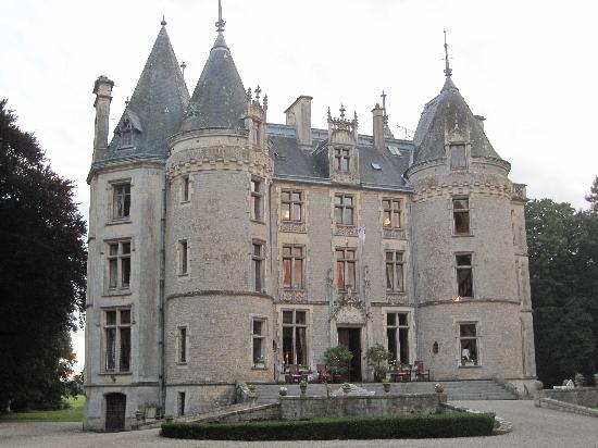
I've picked up a terrace, for the above, and also the château from the newer range, which will more than adequately pass for the Chateau Isle St. Marie.


Monday, 2 February 2015

Chef-Du-Pont - the creamery, Plan B

The best laid plans...

Still. I got a good blog post out of plan A.

Plan B is Ade Deacon's fault: he found the perfect eBay item in the right scale, that saves the headache of doing those northlight roof bits....


It's a TT scale (1/100th, i.e. 15mm near as damnit) Triang engine shed, and it arrived last week. OK - so the roof is more regular, and it's missing two chimneys but a) I don't care THAT much and b) work has a 3D printer which'll fix the chimney!

OK, so it'll also need a little work to add doors etc, but that's half the fun!

Thursday, 1 January 2015

Chef-Du-Pont - designing the creamery

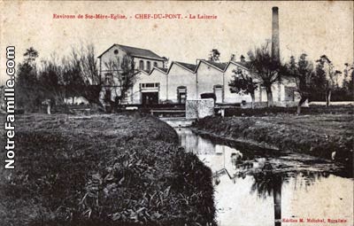
First up, then, at least in principle, is to set about building the Nestle creamery that is just short of the bridge over the Merderet. The picture on the right shows it in context, and you can see the big chimney and the factory building with the 6 element north light roof (highlit). That picture is probably enough to get us rough length/width proportions.

As an aside - you'll also notice from the postcard picture a three storey white building to the left of the factory with an end round window.  The postcard is pre-war, and the building appears to have been extended between that and the 8th June '44 aerial photo above. Current plans are to build this using one of Arcane Scenery's 15mm terrace houses. More importantly, though, in the postcard shot you get a good side view and roof profile of the factory, which shows off that it's rather oddly not uniform, the middle two sections being higher and wider.

Annoyingly, though, the photos skewed by perspective, but... we can fix that. Watch. (Note: I'm doing this on a Mac - as I don't use Windows at all (you can't pay me enough), I don't know what the best Windows alternatives are, sorry).

Stage one. Grab the photo into a suitable editing package. I'm using Pixelmator, which is sadly Mac-only, but there are equivalents.

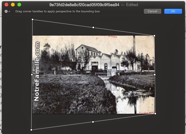
Here I've pulled it into the Transform tool, which allows me to drag it around and distort it. Specifically, I'm going for the Perspective tool, which is rather infuriatingly hidden in Pixelmator under the menu that pops up when you click on the gear icon top left.

Here we've dragged one of the handles to undo the perspective of the picture: the trick is to try and get the ground and roof lines parallel as best you can. Fortunately the tool gives you feedback as you go.

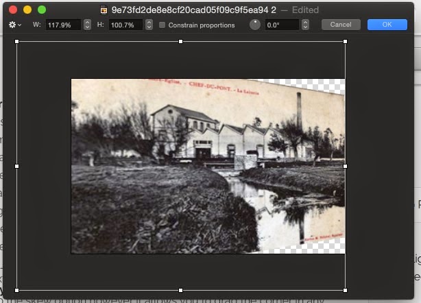
One of the side effects of doing this is that the 'de-perspectivising'-ing process (yes, that IS a word) does shorten things a bit in the horizontal direction. We therefore switch from the Perspective tool to the Free Transform tool and stretch things back horizontally until it looks right. (We could be more picky, but given the resolution of the photo, I think 'looks right' is going to be by fat and away the best plan.)

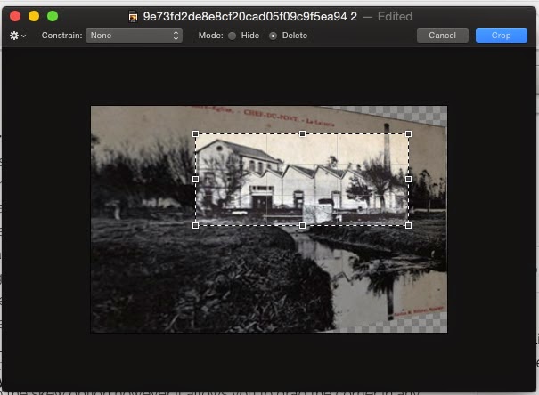
Last step in Pixelmator is to crop out just the bit we want from amid the rest of the clutter, which is pretty simple.

Now we save it, and there we have, at least as a first approximation, a side on view of the creamery.

The next tool I'm using is a vector draw program that will allow me to import images: you may actually be able to pull this off in something as simple as Powerpoint, but I'm using OmniGraffle (again, Mac only) as I happen to have a copy.

(Another aside: OmniGraffle is brilliant for maps which I'll show you in a later post).

The aim here is to produce an outline of the sides of the building in 15mm scale. First off, then, we set up a scale and a grid for our document. 15mm is (as near as dammit) 1/100th scale, so lets set things up so 12" on the paper is 100' in 'real life' (or 1" == 100", or however it pleases you).

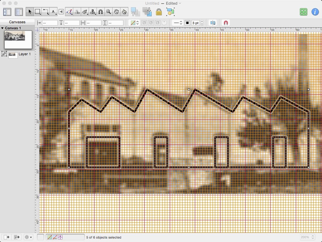
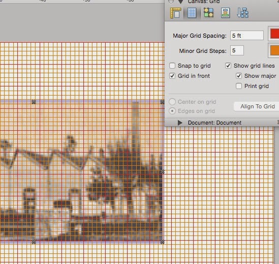
Next we paste our cropped and de-perspectivised (stop arguing, it's still a word: Because I Say So) image into the document, and set OmniGraffle up to display some grid lines. Be fairly aggressive in that you want to see the grid lines as a guide: I've basically set it up with a minor grid line every foot, bright red and orange and on top of everything else.

The grid is what you use as a guideline to scale your image - pick a feature that you can make a decent guess of the height of, or can measure from a map, a plan or another photo. If it's a normal building, doors are just over 6', for example - as this is a factory, I'm guessing they're a bit higher. With that and the grid as a helper, scale the image till one of your chosen features is the right size, and then send it to the back, set its opacity to about 50% so you can see to draw over it, and most important of all, lock it or make it part of the background (your program should give you one of these options) so it won't MOVE! :D (believe me, if you forget to do this you'll get very frustrated very fast)

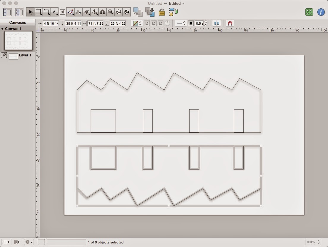
Finally, you can take a line drawing/polygon drawing tool, and trace the important outlines of your building. I've switched the grid above to 6" (scale) just to make it easier to line up bits of the roof. Once you're done, hide the grid and your image, duplicate your outline to make the other side, and print.... :D

Next time, I better nip out and buy some artists' board to make the damn thing :D


Monday, 29 December 2014

Chef-Du-Pont - introduction

Some of my readers may remember that at Operation: Market Laden 2, we put a version of the IABSM scenario 'Bloody Omaha' on as a game.

Not to be outdone, the plan for OML3 is to put on the German counterattack on the Merderet bridge at Chef-Du-Pont late on D-Day, as set out in both the "Where The Hell Have You Been Boys?" and "All-American" IABSM scenario books. This promises to be another fun scenery build, since it's set in the flooded valley of the Merderet, and the basic action takes place on a series of causeways across the valley.

I've already started my research: in addition to the scenario information, there's a decent Google Maps aerial photo, although the river has had its course changed by the hand of man since the war, as well as a 1948 aerial picture. On top of that, the National Collection of Aerial Photography has some aerial photos taken on D-Day+2, showing the flooding - for a reasonable sum (£20) you can have a year's subscription which allows you to zoom in on any/all of their pictures.

The flooded valley looks like a pretty easy build - we have enough blue boards at the club to make the floodplain itself (maybe with a little brushwork to alleviate the plain colour), and the raised bits of land can be made from 25mm craft foam, as can the causeways. There are two key buildings that need making, though: one is the Château de L'Isle Marie, which is probably going to be represented by the Sarissa château, if they make it in 15mm in time. The other is what's now the Nestlé creamery at the end of the bridge in Chef-du-Pont (connoisseurs of French food should be aware it now makes the Mont Blanc cream desserts!), which is a fairly distinctive looking northlight-roofed building with some ancillary buildings.

The first part of the project, therefore, is going to be to build the creamery, probably on an A3 or so piece of MDF. Watch this space!

Friday, 27 June 2014

Designing a setting: part 3 - technology, cheese, open-endedness and replay value

Way back when I started this series of thoughts, I got some very useful comments on the initial post, which I'm going to pick up on now that we've covered fluff as a key ingredient to a setting. Specifically, I'm thinking about open-endedness, and development/evolution, which means it's 'Mike waffles and ponders' time!

There's a tricky line to draw here. In an ideal world, story development is/should be a given. It's about the fluff - your setting moves along - much as (say) the VBCW setting does - so that there are always new things happening, but not so fast that people don't have time to play with what's available. If we look at the real-world setting of WW2 as an example, in six years an awful lot happens, factions rise and fall, technology advances...

Not all settings get this last bit right. Battletech (I quote this a lot, because as big, sweeping, SF settings go, it's one of the biggest and for the most part best) doesn't, in my opinion. The arrival of the Clans is a massive 'outside context problem', which isn't, in and of itself, an issue - it gives the existing factions new adversaries, the chance for new Alliances. But unfortunately at around about the same time, the Clans bring new tech with them, and the existing factions develop new tech, and it's game breaking tech, and they got that bit badly wrong. One of the core unwritten precepts of the original 3025/6 tech Battletech was that, to sum it up crudely, the only things that could blow a Mech's head off in one shot could only do so at short range. With the advent of the 3050-era tech, and extended range PPCs and Ultra AC-20s (for example), death from long range was suddenly much more likely. To be fair, this is actually a rather dumb piece of brokenness in the rules about the amount of armour and internal structure 'Mechs can have: the rules were originally designed around 3025-era balance, for which they work beautifully.

40K, of course, does this far worse, in that it doesn't really even pretend that what it's doing is advancing the setting - it's just pure 'cheese' - changes to the rules, because it can, and because it wants another pull on the direct line from little Johnny to daddy's plastic.

It's an interesting problem, though. You can make the argument that WW2 has this: bring a Tiger into an early war scenario, and it's massively unbalancing. And if you want to 'follow along' with WW2 as the campaign advances, you wind up replacing all your armies by the end of the war to keep with the story. But at least with any self-respecting set of rules, the game doesn't go out of whack if your forces are from the same period with the setting.

War, though, is a great driver for technology. You can't escape how much military technology advanced during both world wars and then slowed down a large amount thereafter. If your setting is at all high-tech, it's difficult to avoid (Moore's Law, anyone! :D) the fact that technology will and should get better over time unless you've hit some arbitrary, physical or scientific limit (the speed of light, the size of an atom of silicon, the strength/height of a normal human, etc).

Having waffled my way through that (*grin*) I think what I'm saying is that advancing the 'story' of a campaign is great: giving people new opponents and/or new contexts in which to fight enhances the odds they'll stick with your setting, that magic that is 'replay value'. And sure, everyone likes 'the new shiny': the trick is not to do new in-game tech and weaponry for the wrong reasons, not to make it so awesome that you can't, effectively, play the game without it. Introduce it slowly, make it scarce, make it have disadvantages - even if these boil down to 'it's so expensive you can only have 1', or 'you can have that Tech 3 energy weapon, but you need to mount it on a slow, massive chassis that can't use other tech because it needs all the power...'

In short - it's as much a game-design balance problem as anything else. If your developing story starts to lead you towards the new shiny, you need to consider long and hard what it does to the game.

Friday, 4 April 2014

Designing a setting: part 2 - Fluff

Finally making my way back to the series I started on the way to Seattle - designing a setting. Several people made very useful comments on the introductory post, and I'll pick up on those in the inevitable articles that happen after the one's I've planned :D

Not taking things in quite the order I listed them at the start, we'll begin with:

Fluff. Fluff is that stuff that isn't essential to your setting in terms of rules, army lists etc. The peripheral writing, the backstory, the art, you name it...You can play in your setting without it...

...well, actually you can't.

Ok. You can. But all you're doing at that point is pitting two sets of statted up miniatures against each other and having a battle.

The best settings, the ones that draw you in, are the ones where the fluff grabs you and draws you in, inspires you. It's the stuff that gets you immersed in the setting, wanting to be a part of it.

Let me give you a couple of examples.

Like or loathe the business practices behind it, the Warhammer 40K universe absolutely rolls in fluff on an epic (see what I did there? :D) scale. It might not be your cup of tea, but I guarantee you that it wouldn't sell half as well if people didn't like the backstory.

On a more personal note - I adore the pre- and early Clans setting of Battletech, and all its history. Two particular bits of its story grabbed me - one was the character of "Snow Fire" (after which one of my character's[1] 'Mech's got named), the other the mercenary unit the 12th Vegan Rangers. The latter scored at least in part because it wasn't as well-fleshed out as the more 'famous' units in terms of having books written about it (See? whole books! Fluff! And THEN some!), while having enough tantalising hints dropped to draw me (and a number of other players) in and want to create more in the setting. (We'll come on to sub-creation and open-endedness later in the series.)

And a question: those of you who read this blog and play or intend to play Dux Brit. How much have Andy and my campaign narratives helped to draw you in? (Dux Brit has some other features, setting and campaign wise, that we'll discuss later, but for now... :D)

[1] I'm 20 years the better writer since that story was written. Be gentle :D

Saturday, 8 March 2014

Designing a setting: part 1 - Introduction

Greetings from my weekend detour to San Jose :D

As I'm doing some proofreading before breakfast, I've been pondering concepts around world and setting design for something I'm working on this week. I did have a bit of a think about this a while back, with specific reference to all the Kickstarters that were springing up at the time, in fact... Out of that came several desirables for a setting:

  • Conflict (without which you don't have a game)
  • Multiple factions (not necessarily, but...)
  • Fluff (to draw your reader in - 'immersion' if you like)
I'm going to add one more to this, and skim it briefly in this post before I dedicate a post to each one
  • Immediacy.
This is a topic I've covered before, in the one lone episode of my podcast (before Neil nabbed me), although in setting design it's a slightly different thing. Basically it's that core concept that makes you able to 'get stuck in' to a setting quickly, without having to do tons of prep work before you start. With it comes its counterpart and (often) opposite, flexibility: the less reading and prep work users of your ruleset and/or setting have to do, the more likely they are to pick it up.

So, with that in mind, I'm off to do some copy-editing, and then grab breakfast. Watch this space for the next part.


Saturday, 8 February 2014

Heraldry 101, summary post

As promised:

Heraldry 101, part 1 - introduction
Heraldry 101, part 2 - what colour is it?
Heraldry 101, part 3 - left, right, top, bottom and divisions
Heraldry 101, part 4 - ordinaries, and the Rule of Tincture
Heraldry 101, part 5 - charges, and arranging them
Heraldry 101, part 6 - Lions, Tigers (well, almost) and Bears, oh my!
Heraldry 101, part 7 - an aside, and answers
Heraldry 101, part 8 - strictly for the birds
Heraldry 101, part 9 - Fish Heads. Roly poly fish heads
Heraldry 101, part 10 - Crosses
Heraldry 101, part 11 - Marshalling Coats Of Arms
Heraldry 101, part 12 - Marks of Cadency
Heraldry 101, part 13 - 'patterned' backgrounds
Heraldry 101, part 14 - edges
Heraldry 101, part 15 - a broader palette

Tuesday, 28 January 2014

Heraldry 101 - part 15 - a broader palette

Let's go right back to part 2, shall we?

If you've been with this series since the start, you'll remember that I started out with the 'core' tinctures - colours, metals and furs - gules, sable, vert, azure, argent, or, ermine and vair

Time for the rest!

The other common colour is purple, or purpure. Additional to that are a number of other colours, usually referred to as stains: the most common of these are:

  • tenné - from an old French word from which we get, unsurprisingly, 'tawny', is a brownish orange shade
  • murrey - a 'mulberry' shade, sort of reddish-purple
  • sanguine - from an old French word meaning (obviously enough) blood red, is an orangey-red shade. 
Stains are mostly only known in post-mediaeval heraldry, and often found in livery. For those who remember Robert Lewis Stevenson's "Black Arrow", set in the Wars of the Roses:
"The chief part were in Sir Daniel’s livery, murrey and blue, which gave the greater show to their array."
Murrey and blue seems to have been quite common as a livery - the Duke of Clarence and Richard of Gloucester (Richard III), among a number of Yorkist lords.

And then we come to the extra furs, which come in a bewildering array I'll just list with handy examples from Coat of Arms Design Studio.


Counter-Vair

Ermines

Erminois
Pean

Potent


Counter-potent


And there you have it. Heraldry 101.

I hope you enjoyed this series - I'll stick up a handy index post in a couple of days so you can find things.


Respectfully dedicated to the memory of Arthur Whitaker, teacher, Methodist local preacher and my grandfather, without whom I'd not love a number of the things I do today, and whose much thumbed and loved copy of "Boutell's Heraldry" has been my, and thus your, guide through this series.

Saturday, 14 December 2013

Battle Report - 09 Dec 2013 - Dux Britanniarum

Andy and I were long overdue for the next round of the Linnius Campaign in Dux Britanniarum - checking back, we last played in July! Time since has been taken up with holidays, playtesting for Carve out a Kingdom and heaven knows what else, but it was definitely about damn time. 
We rolled the church scenario - evidently Aelfric thinks they're easy pickings, since he keeps going for them. However, the Saxons haven't succeeded in one since the theft of the Holy Knucklebone of St. Cadwyr, back before Leofric the Drunkard died, so heaven knows why!

I started badly with a rubbish force morale roll, which meant I was starting on 6. Same plan as last time - which was also a mistake. Last time, I failed to make the necessary rolls for looting in time, and this time was the same. The Saxons came on with a long run up the left hand table edge to get to the church and some handily placed marshes and hills stopping the British (who came on the middle of the right hand side) getting stuck in. So I did exactly what I did last time, sent the hearthguard to engage the British, along with one unit of warriors, and let the rest loot the church. 

Which was fine, except that despite a FAT hand of awesome cards, Andy got to go first in the battle, and Aelfric and the hearthguard got their butts kicked. 

Meantime, Ecgwine's group reached the church, and rolled a 6 on their first turn of looting. And from then on with two groups activating each time through the deck, completely failed to roll another 6 in 6 turns. (Odds, for those interested, just over 11%).

Beornwulf's lone group of warriors made a stand on the hill, which is frankly where Aelfric should have been, while the former added to my pool of looting rolls. This wasn't a dumb plan, as the combination of them being on a hill (-1/dice move), Andy's force being in shield wall (one fewer dice/move) and my archers knocking shock off them like it was going out of fashion, they took their own sweet time getting into contact. Unfortunately once they did, my dice deserted me, and in the end I lost the fight, Aelfric (who'd joined the fight) and Beornwulf both got wounded and byebye force morale...

Ah well. Tomorrow's another day.


Related Posts Plugin for WordPress, Blogger...